
“I challenge the impersonality that data might communicate, designing visual narratives that connect numbers to what they stand for: knowledge, behaviors, people.”
These are the words of Giorgia Lupi, a known information designer based in New York. As the quote suggests, Lupi fabricates the bridge to link the analogue and the digital through the exploration of how data ought to be represented. Her work involves creating visual models and metaphors to represent the data. Her approaches to information design aims to bring personality to data by presenting it in an engaging, visual manner.

Giorgia Lupi had studied Architecture in Ferrara University and graduated in 2006. Since this time, she has worked on several multidisciplinary projects in fields such as information and interaction design. Eventually in 2011, she worked to receive a PhD Design Milan Politecnico, at Density Design Lab[1].
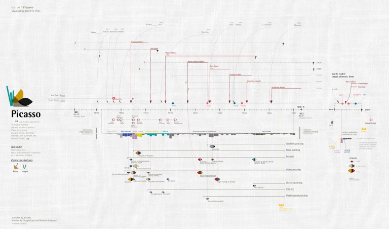
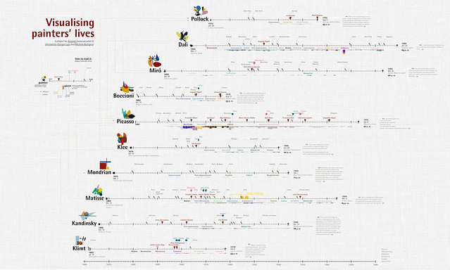
She mentioned in an interview that data visualization “came natural[ly] to [her] to progressively focus more on the quantitative side within the information design field”[2]. She found potential in working visually and using the power of visuals to convey information. This led her to co-found an information design company called Accurat in 2011[3]. Accurat is known for its creation of data visualisations and several analytical tools, working for the exploration of how analytical representations can be aesthetically pleasing while maintaining the accuracy of the data.


With this unique approach to data representation, Lupi has specific methods in creating her visualizations. She is a firm believer in the importance of sketching, noting that she “always start[s] from sketching then [she] approaches the data in a hand-crafted way”[4]. She has always had an appreciation for the art of manual creation mostly because she believes it leads to specialised designs that tackle the specific issues of data problems she is working with. In other words, she feels that by taking this approach, she develops a better understanding of the actual data she is working with, thus strengthening the connection she has with her work. Her ability to craft stunning infographics by hand and tireless efforts to this field of design was fruitful, as she has garnered several awards over the years for her work. She has received awards from the Strata Conference, Core 77 Awards, Cannes Festival 2013 and more[5]. She has been featured in several books related to creative infographics as well.
Her career as an information designer so far has proved to be quite a successful one, where she has produced a plethora of visually stunning infographics. An example of this is the “Dear Data” project[6]. It is a year long project where she and her partner would collect and measure specific data about their lives and mail it to the other person. This data would then be received with all the marks of its journey to reach its destination, representing the idea of the creation and passing on of data visualization through analogue means and the beauty in the small imperfections of this method. Excerpts from this project have been exhibited in several shows all over the world and has been awarded the Gold Medal in “Data Visualization Projects” category as well as “The Most Beautiful Project” at the Kantar Information is Beautiful Awards 2015.


Giorgia Lupi’s strive to connect, her pursuit of beauty, and appreciation for all the effort required in between marks her as one of the most influential information designers of this age. But what truly makes her a unique designer was her faith in the importance of analogue processes in design, which is an approach all aspiring designers can learn from.
